
2.3 Data Visualization#
This section introduces visual tools to explore and compare relationships within the df_y_clean dataset. For each plot type, we show both matplotlib and seaborn implementations in side-by-side subplots, using consistent data for direct comparison.
Documentation
Although LLMs often replace documentation these days, the best way to make sure you remember what you use and how to use it is still to consult the documentation:
Matplotlib Cheat Sheets
Matplotlib Documentation
Seaborn Cheat Sheets
Seaborn Documentation
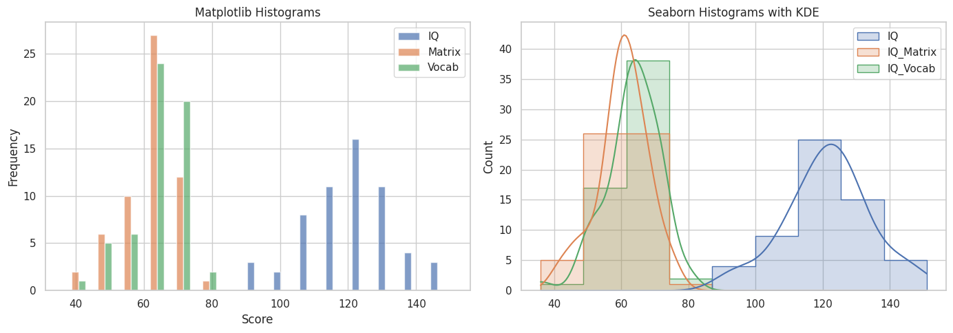
2.3.1 Histogram#
Purpose: Visualize the frequency distribution of IQ scores.
fig, ax = plt.subplots(1, 2, figsize=(14, 5))
ax[0].hist(df_y_clean[["IQ", "IQ_Matrix", "IQ_Vocab"]], bins=15, label=["IQ", "Matrix", "Vocab"], alpha=0.7)
ax[0].set_title("Matplotlib Histograms")
ax[0].set_xlabel("Score")
ax[0].set_ylabel("Frequency")
ax[0].legend()

sns.histplot(data=df_y_clean[["IQ", "IQ_Matrix", "IQ_Vocab"]], kde=True, element="step", ax=ax[1])
ax[1].set_title("Seaborn Histograms with KDE")

plt.tight_layout()
plt.show()
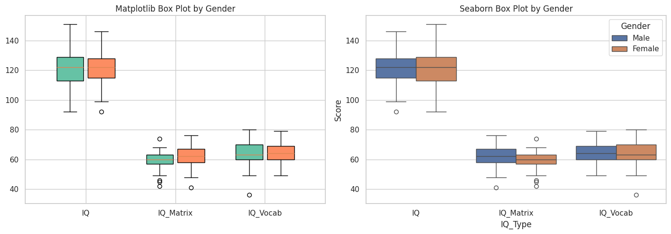
2.3.2 Box Plot#
Purpose: Show distribution, spread, and outliers in IQ scores, grouped by gender.
fig, ax = plt.subplots(1, 2, figsize=(14, 5))

df_y_melt = df_y_clean.melt(id_vars="Gender", value_vars=["IQ", "IQ_Matrix", "IQ_Vocab"],
                            var_name="IQ_Type", value_name="Score")

# Matplotlib approximation via grouped boxplot
groups = df_y_melt.groupby(["Gender", "IQ_Type"])["Score"].apply(list).unstack()
positions = np.arange(len(groups.columns))
width = 0.35

for i, gender in enumerate(groups.index):
    bp = ax[0].boxplot(groups.loc[gender].values,
                       positions=positions + i * width,
                       widths=0.3,
                       patch_artist=True,
                       boxprops=dict(facecolor=["#66c2a5", "#fc8d62", "#8da0cb"][i % 3]))
ax[0].set_xticks(positions + width / 2)
ax[0].set_xticklabels(groups.columns)
ax[0].set_title("Matplotlib Box Plot by Gender")

# Seaborn
sns.boxplot(x="IQ_Type", y="Score", hue="Gender", data=df_y_melt, ax=ax[1])
ax[1].set_title("Seaborn Box Plot by Gender")

plt.tight_layout()
plt.show()
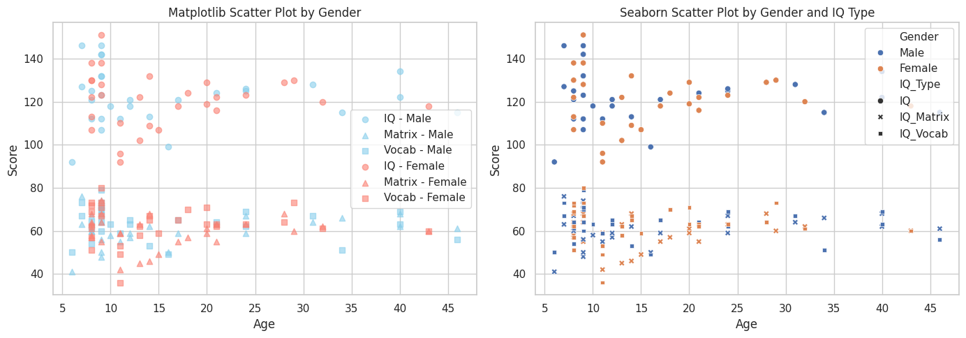
2.3.3 Scatter Plot#
Purpose: Show the relationship between Age and each IQ metric, colored by Gender.
fig, ax = plt.subplots(1, 2, figsize=(14, 5))

colors = {'Male': 'skyblue', 'Female': 'salmon'}
for gender, color in colors.items():
    subset = df_y_clean[df_y_clean["Gender"] == gender]
    ax[0].scatter(subset["Age"], subset["IQ"], label=f"IQ - {gender}", alpha=0.6, color=color)
    ax[0].scatter(subset["Age"], subset["IQ_Matrix"], label=f"Matrix - {gender}", marker='^', alpha=0.6, color=color)
    ax[0].scatter(subset["Age"], subset["IQ_Vocab"], label=f"Vocab - {gender}", marker='s', alpha=0.6, color=color)
ax[0].set_title("Matplotlib Scatter Plot by Gender")
ax[0].set_xlabel("Age")
ax[0].set_ylabel("Score")
ax[0].legend()

melted = df_y_clean.melt(id_vars=["Age", "Gender"],
                         value_vars=["IQ", "IQ_Matrix", "IQ_Vocab"],
                         var_name="IQ_Type", value_name="Score")
sns.scatterplot(data=melted, x="Age", y="Score", hue="Gender", style="IQ_Type", ax=ax[1])
ax[1].set_title("Seaborn Scatter Plot by Gender and IQ Type")

plt.tight_layout()
plt.show()
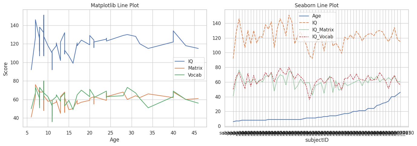
2.3.4 Line Plot#
Purpose: Visualize trends in IQ scores across age.
df_y_sorted = df_y_clean.sort_values("Age")
fig, ax = plt.subplots(1, 2, figsize=(14, 5))

ax[0].plot(df_y_sorted["Age"], df_y_sorted["IQ"], label="IQ")
ax[0].plot(df_y_sorted["Age"], df_y_sorted["IQ_Matrix"], label="Matrix")
ax[0].plot(df_y_sorted["Age"], df_y_sorted["IQ_Vocab"], label="Vocab")
ax[0].set_title("Matplotlib Line Plot")
ax[0].set_xlabel("Age")
ax[0].set_ylabel("Score")
ax[0].legend()

sns.lineplot(data=df_y_sorted[["Age", "IQ", "IQ_Matrix", "IQ_Vocab"]], ax=ax[1])
ax[1].set_title("Seaborn Line Plot")

plt.tight_layout()
plt.show()
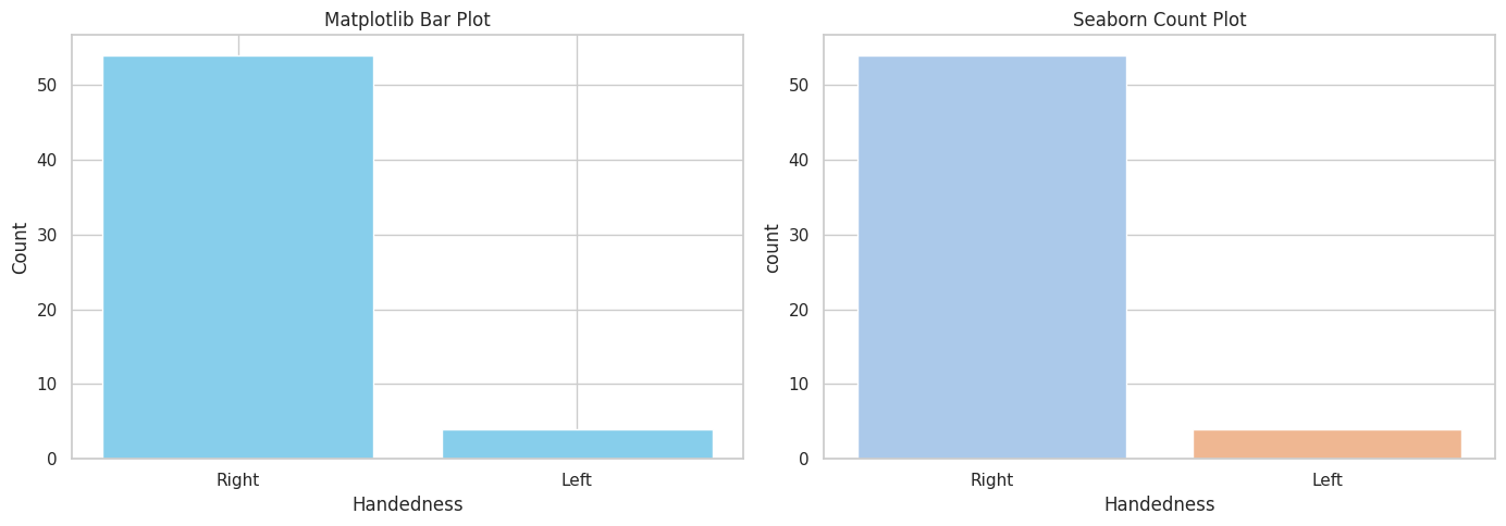
2.3.5 Bar Plot#
Purpose: Show frequency of different handedness categories.
counts = df_y_clean["Handedness"].value_counts()
fig, ax = plt.subplots(1, 2, figsize=(14, 5))

ax[0].bar(counts.index.astype(str), counts.values, color="skyblue")
ax[0].set_title("Matplotlib Bar Plot")
ax[0].set_xlabel("Handedness")
ax[0].set_ylabel("Count")

sns.countplot(x="Handedness", data=df_y_clean, ax=ax[1], palette="pastel")
ax[1].set_title("Seaborn Count Plot")

plt.tight_layout()
plt.show()
/tmp/ipykernel_2453/676046580.py:9: FutureWarning:

Passing `palette` without assigning `hue` is deprecated and will be removed in v0.14.0. Assign the `x` variable to `hue` and set `legend=False` for the same effect.

  sns.countplot(x="Handedness", data=df_y_clean, ax=ax[1], palette="pastel")
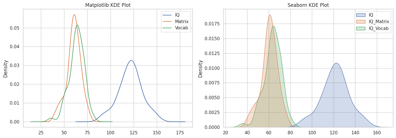
2.3.6 Density Plot#
Purpose: Compare smoothed distributions of IQ types.
fig, ax = plt.subplots(1, 2, figsize=(14, 5))

df_y_clean["IQ"].plot.kde(ax=ax[0], label="IQ")
df_y_clean["IQ_Matrix"].plot.kde(ax=ax[0], label="Matrix")
df_y_clean["IQ_Vocab"].plot.kde(ax=ax[0], label="Vocab")
ax[0].set_title("Matplotlib KDE Plot")
ax[0].legend()

sns.kdeplot(data=df_y_clean[["IQ", "IQ_Matrix", "IQ_Vocab"]], fill=True, ax=ax[1])
ax[1].set_title("Seaborn KDE Plot")

plt.tight_layout()
plt.show()
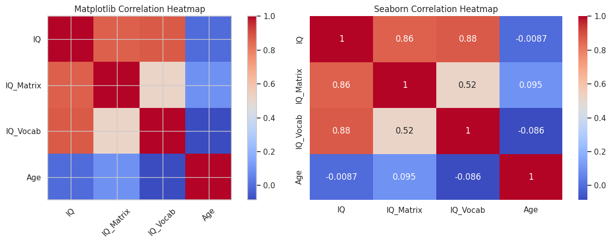
2.3.7 Correlation Heatmap#
Purpose: Examine pairwise relationships between numerical variables.
corr = df_y_clean[["IQ", "IQ_Matrix", "IQ_Vocab", "Age"]].corr()
fig, ax = plt.subplots(1, 2, figsize=(14, 5))

im = ax[0].imshow(corr, cmap='coolwarm')
fig.colorbar(im, ax=ax[0])
ax[0].set_title("Matplotlib Correlation Heatmap")
ax[0].set_xticks(np.arange(len(corr.columns)))
ax[0].set_yticks(np.arange(len(corr.columns)))
ax[0].set_xticklabels(corr.columns, rotation=45)
ax[0].set_yticklabels(corr.columns)

sns.heatmap(corr, annot=True, cmap='coolwarm', ax=ax[1])
ax[1].set_title("Seaborn Correlation Heatmap")

plt.tight_layout()
plt.show()
Common matplotlib Plotting Parameters
These parameters help you customize plots when using functions like ax.plot(), ax.scatter(), ax.boxplot(), or ax.bar():
color=– Set the color of lines, markers, or bars (e.g."red","skyblue").linestyle=– Define the line style:"-"(solid),"--"(dashed),":"(dotted).linewidth=– Thickness of the line.marker=– Shape of data points in plots:"o"(circle),"s"(square),"^"(triangle).alpha=– Transparency level (0 to 1).label=– Text label to show in the legend.widths=– Width of boxes inboxplot().positions=– Specific x-axis positions for elements (e.g. for boxplots or bars).edgecolor=– Color of outline/border.facecolor=– Fill color for shapes like boxes or bars.hatch=– Pattern inside bars/boxes (e.g.'/','\\','-').
Common seaborn Plotting Parameters
These parameters can be used with functions like sns.boxplot(), sns.scatterplot(), or sns.histplot():
palette=– Color palette for categories (e.g."pastel","Set2", or a list of colors).hue=– Grouping variable to color by category.style=– Marker or line style grouped by category (for scatter/line plots).size=– Variable that determines marker size.alpha=– Transparency of elements.linewidth=– Width of lines or box borders.fliersize=– Size of outlier markers in boxplots.dodge=– Separate overlapping elements (e.g.dodge=Truein grouped boxplots).width=– Width of boxes/bars.fill=– Whether to fill areas like density plots (TrueorFalse).